- The Clevrr Capsule
- Posts
- The update you don’t want to miss!
The update you don’t want to miss!
Your business just got a lot easier to understand
Yuvraj Dagur
March 27, 2026
Hey everyone, it’s been a long time since the product updates we needed to share with you.
But better late than never, right?
So here’s the one you’ve been waiting for.
Your business, at a glance. Finally.
We built a new Overview Page for one reason: founders don’t have time.
You open the dashboard and instantly see what matters:
• Net Sales
• Total Sales
• Total Spends
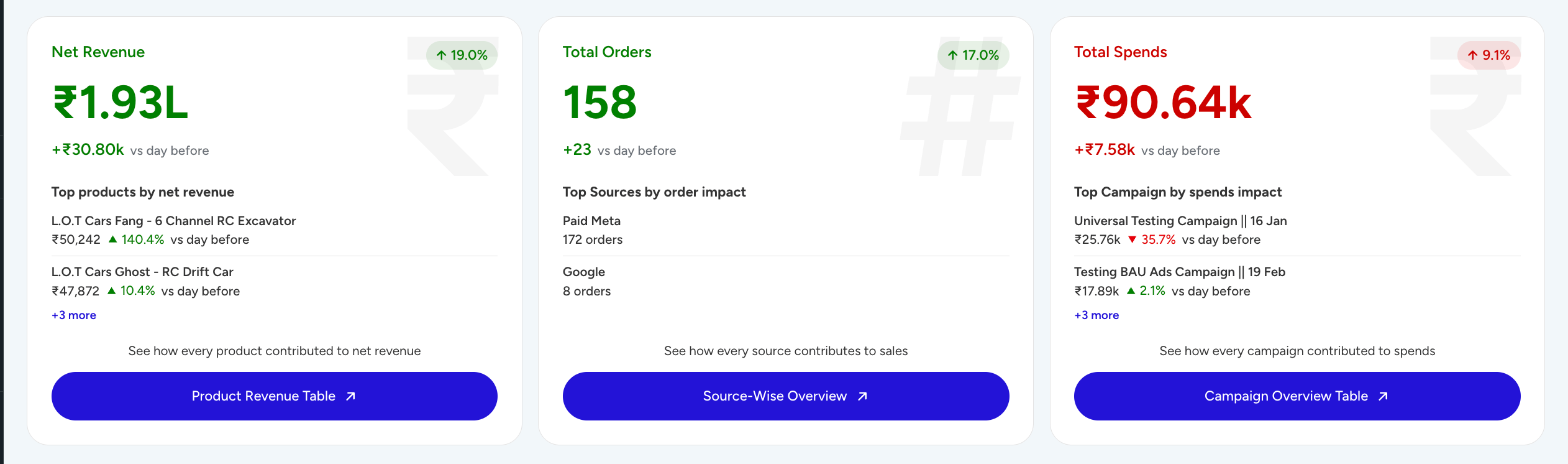
Switch between yesterday, this week, or this month and know exactly how you're doing.

No digging. No confusion.
And when something feels off?
One click takes you deeper:
→ Net revenue → product-level performance
→ Orders → source-wise sales
→ Spends → campaign breakdown
You don’t just see numbers. You understand them.
The hero feature: RCA (Root Cause Analysis)
This changes everything. A big canvas where your RCA will be pinpointed.
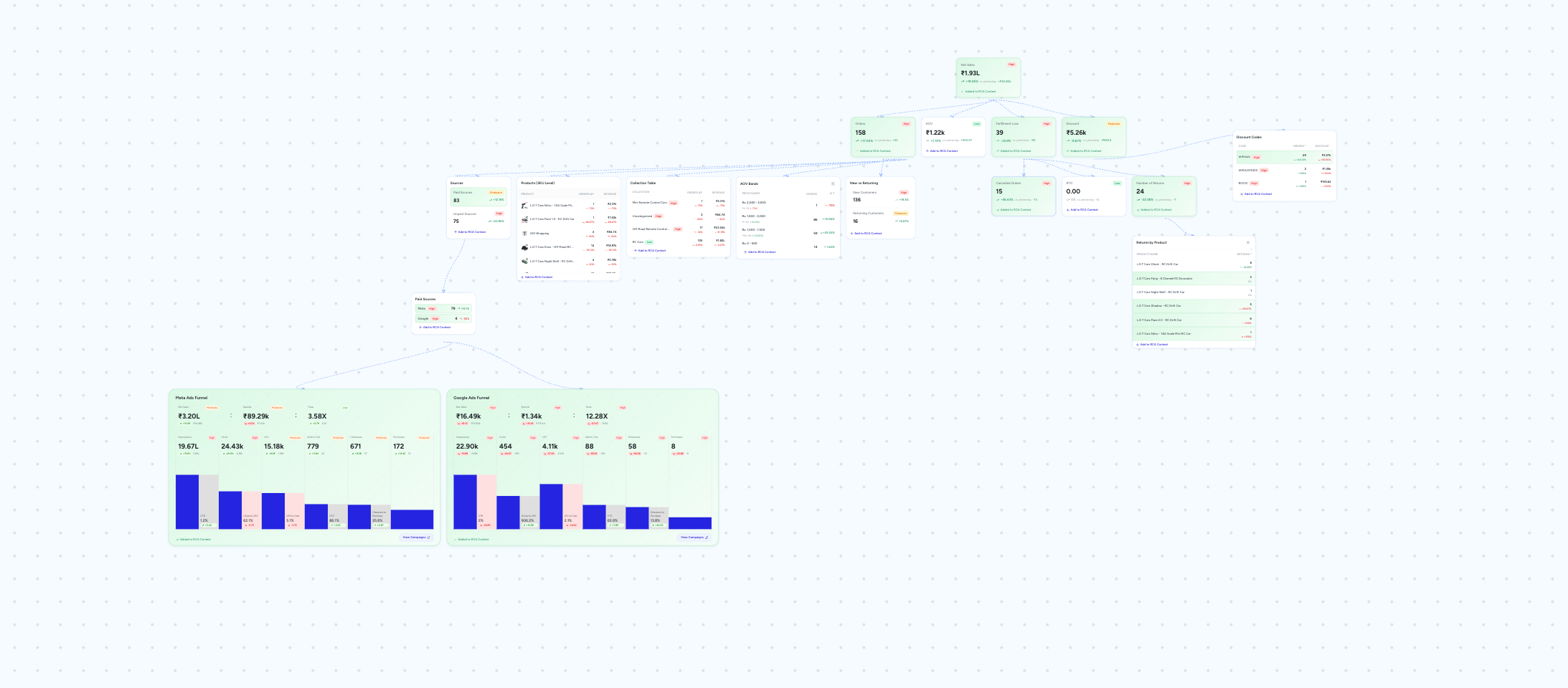
Every day, you can break down:
Why did revenue drop?
Why did it spike?
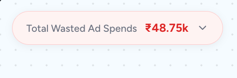
At the top, you’ll see Recoverable Revenue
→ how much you can actually win back
Then you build your RCA context:
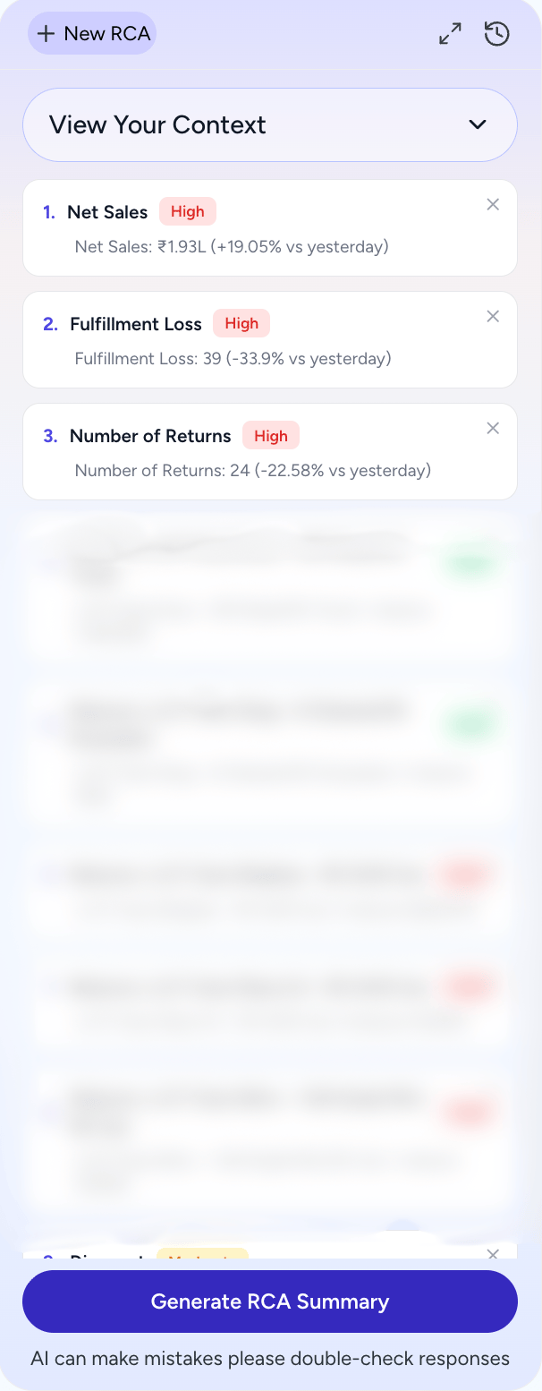
Add components. Add elements. Build the story.
And then let AI do its job.
You get:
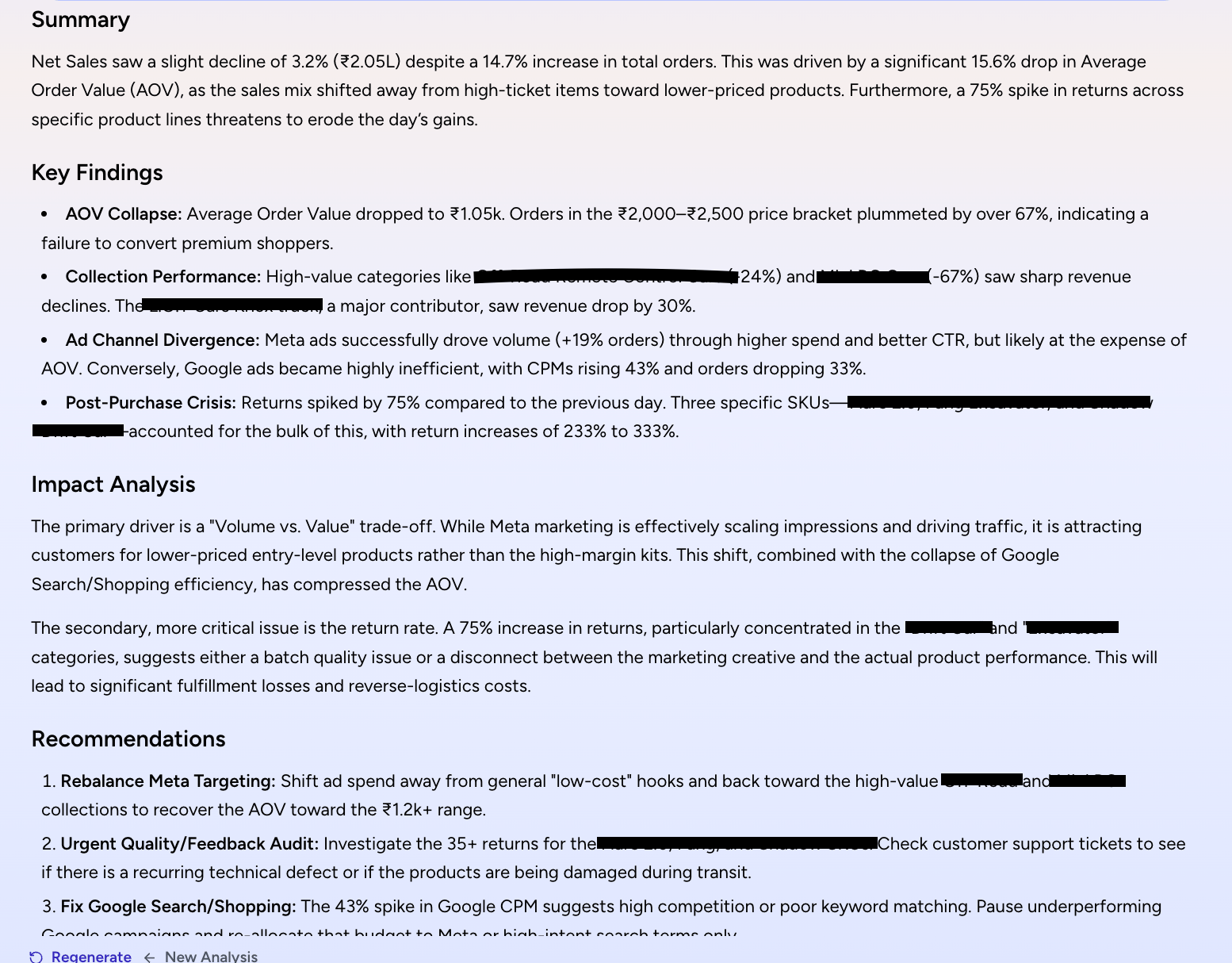
• Summary
• Key findings
• Impact analysis
• Clear recommendations
The more context you give, the sharper the answers.
This is how you stop guessing and start fixing.
AI that actually tells you what’s going on
Right below the three cards, you’ll see your AI Overview.
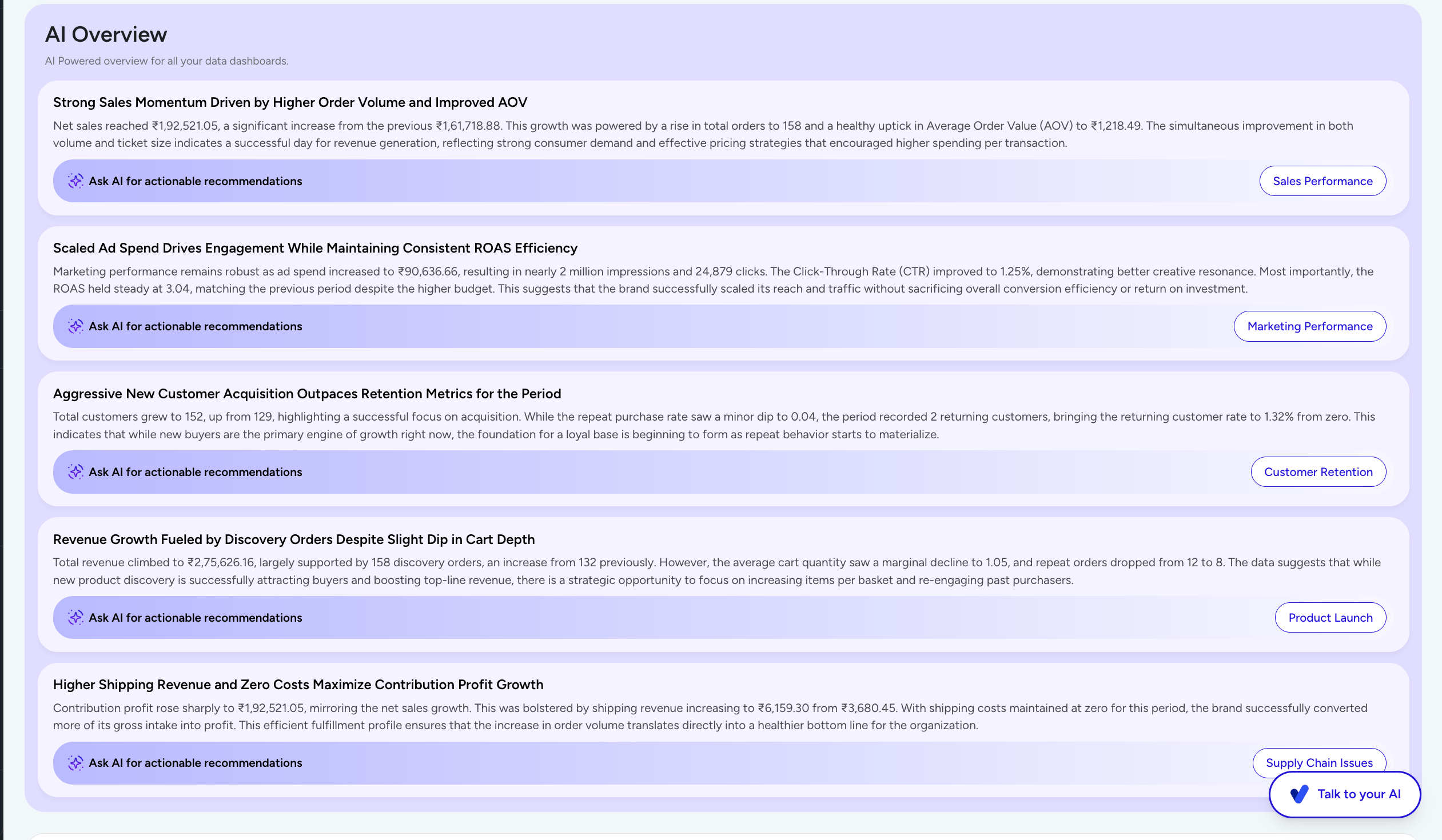
A quick read of what’s happening across your business.
No dashboards. No analysis paralysis.
Just clarity.
Compare anything. Find what’s working.
With Compare Metrics, you can:

• Compare any metric
• Across different dimensions
• With multiple chart views
• Over 1 day, 7 days, or 30 days
This is where patterns start becoming obvious.
Did your actions actually work?
On the left sidebar of the Monitoring Dashboard, you’ll see your recent AI chats.
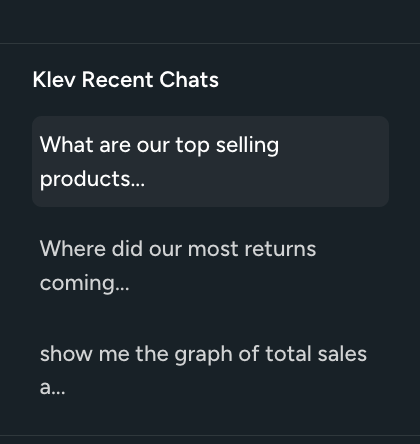
So you can go back and check:
What did you ask?
What did you implement?
Did it improve?
This closes the loop.
Reports that run themselves
In the Reports Section, you can automate everything.
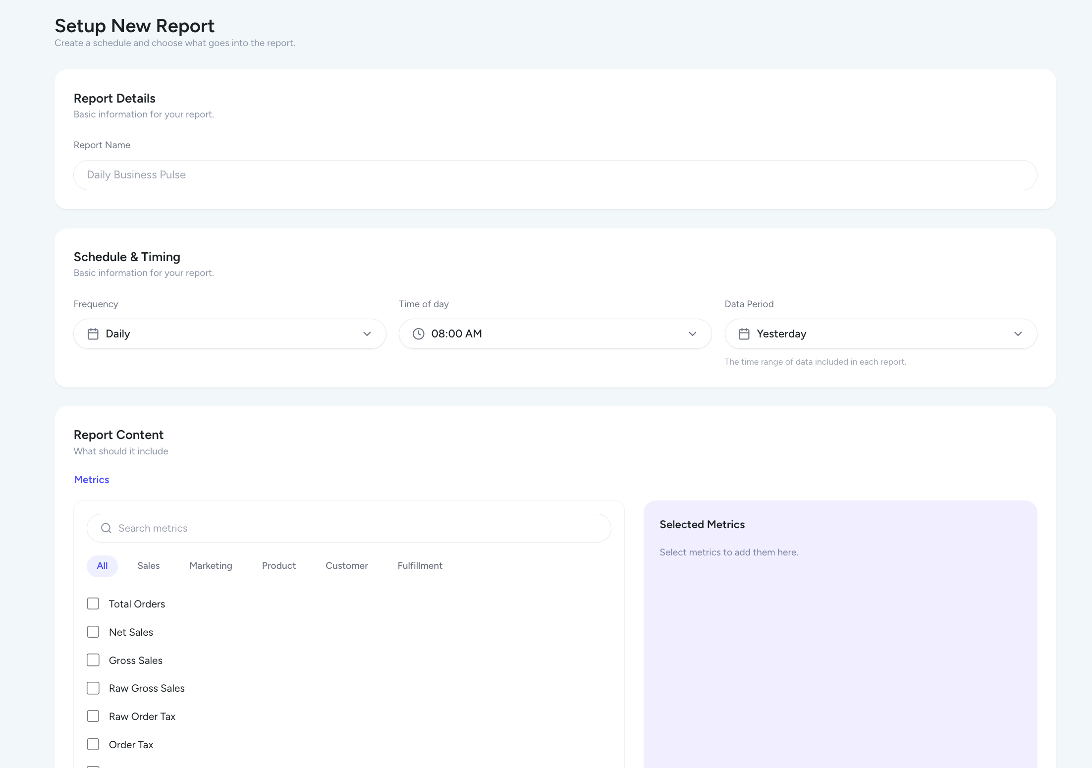
Set:
• What metrics you want
• When you want it
• How often
And it lands in your inbox.
No manual work.
Build your own metrics
Every department dashboard now lets you:
Create your own formulas
Turn them into metric cards
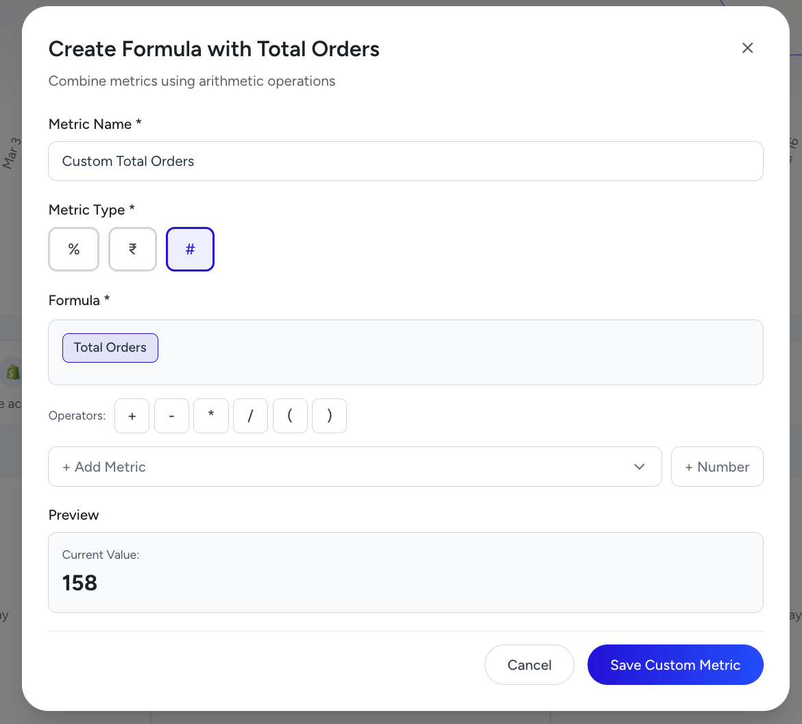
So you’re not limited by predefined numbers.
You define what matters.
See trends instantly
Every card now shows trends
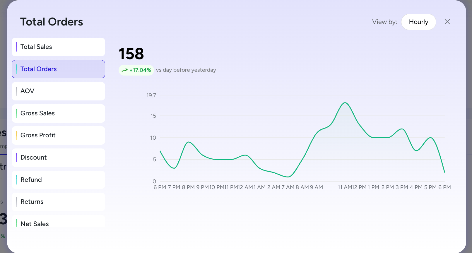
Where did the spike come from?
Where did the drop start?
You don’t just see change. You see the source.
Marketing clarity, finally
Inside the Ad Overview Table:
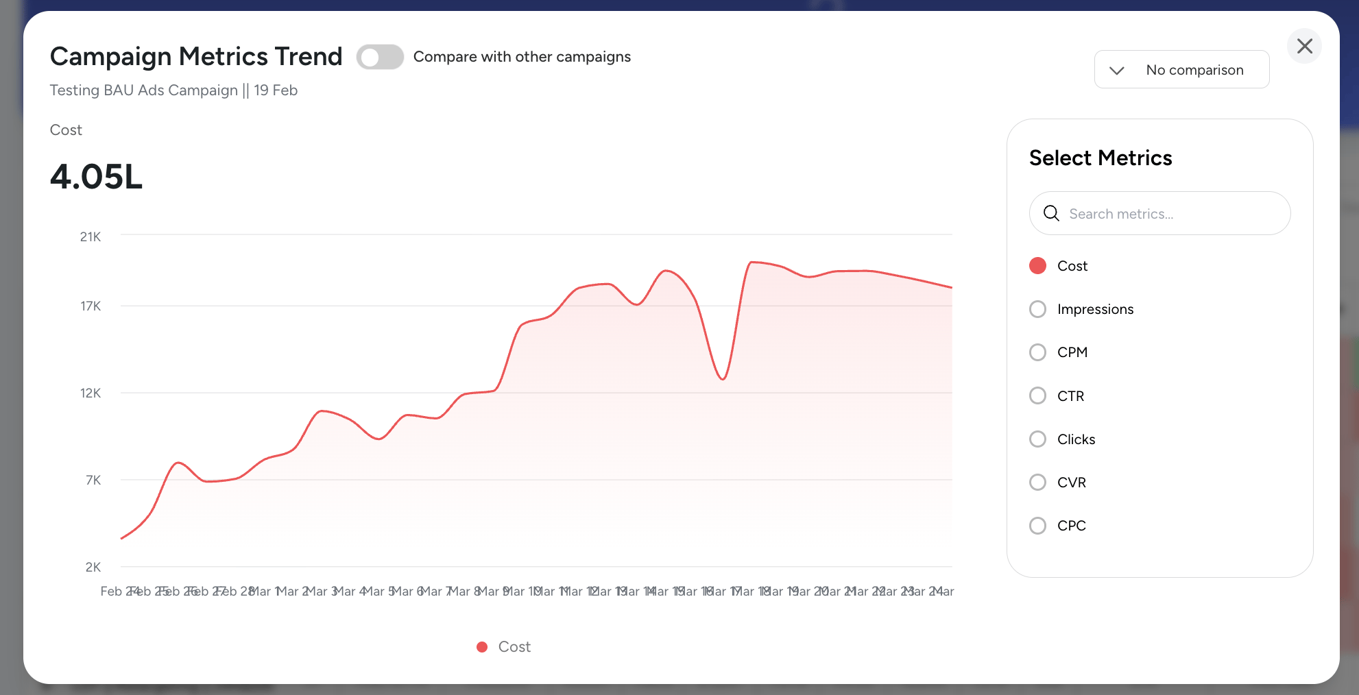
• Compare campaigns
• Compare metrics
• Compare timeframes
• See trends clearly
This trend shows funnel-level insights where the leak is happening and exactly where it starts.
Understand exactly which campaigns are driving results
And how you achieved them.
This update is not about adding features.
It’s about helping you:
See faster
Understand deeper
Act better
You’ll feel the difference.